Endling Zoo Branding + Guidebook

/

Project

Endling is a zoo in our near future, whose occupants are all one creature away from extinction. This guidebook walks viewers through the animals who inhabit Endling, and also discusses the impact of human activities. Click here to download the full booklet.

More information on the design and general process can be found here.


Photo Credits
in alphabetical order by username

Bluth Company Booklet

/

Project

They’ve made a huge mistake. The Bluth Company branches out into food. Click here to download the full booklet.


Photo Credits

All stock was downloaded from freepik.com. Huge thanks to freepik, valeria_aksakova, jcstudio, rawpixel.com, topntp26, lifeforstock, jcomp, and dashu83 for taking such beautiful photos and letting me use them for free.


Fine Print

The Bluth Company cannot accept responsibility for any injuries, illnesses, or deaths resulting from Bluth products. Sorry.

Flick’s Pub Rebranding

/

Project

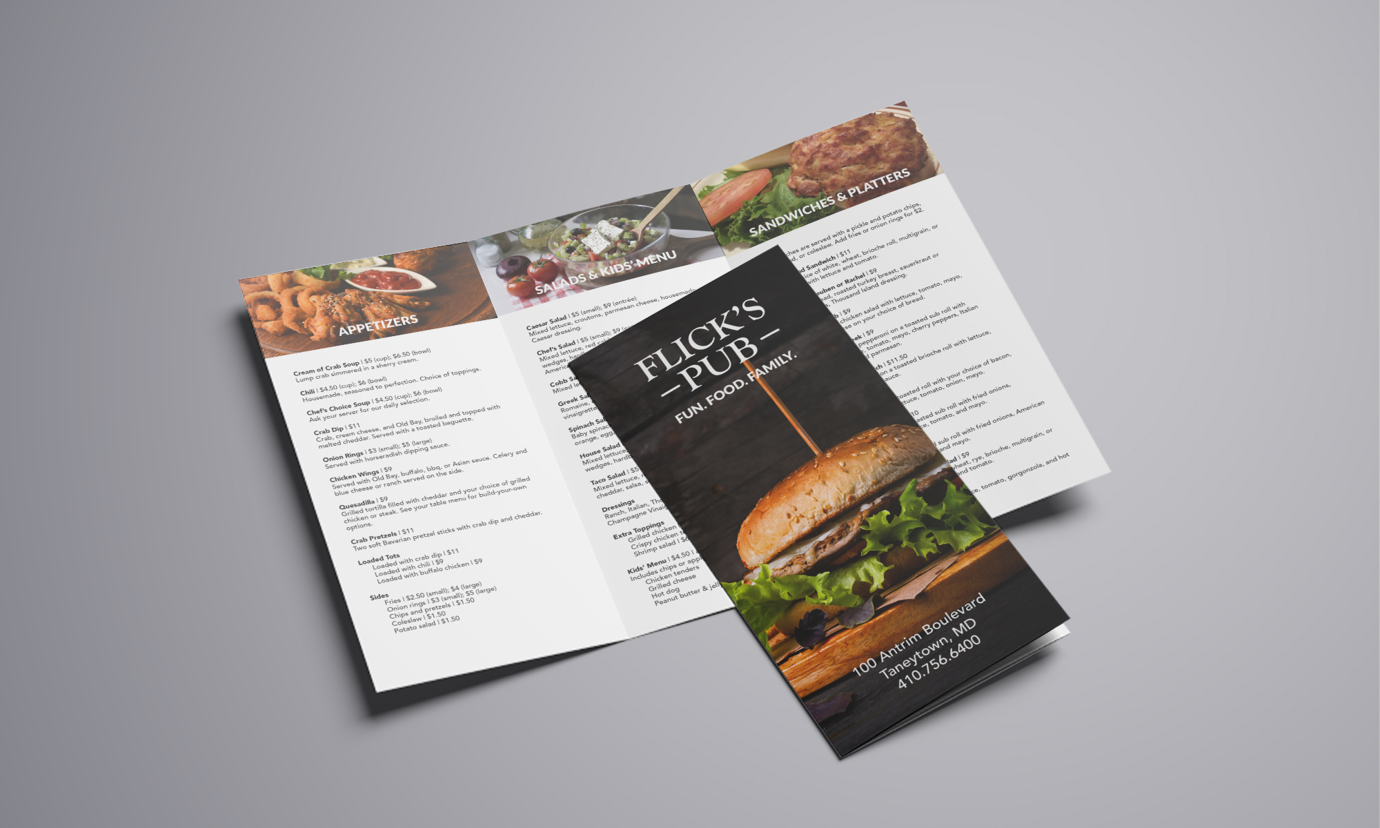
Redesign the logo and carryout menu for Flick’s Pub, the restaurant attached to Lorien Health’s Taneytown facility.


Concept

The client asked me to redesign the logo for their pub using brighter colors, and to revamp their carryout menu (if you’re wondering what the logo and menu looked like originally, here’s a pdf). Though the original sketches focused more on food images, the client requested something more in line with the general Irish pub look; thus, we ended up going with dark green and gold, and also used a more old-fashioned typeface. For the menu, we wanted to replace the Lorien facility pictures with actual food pictures; we were originally going to use the old design with new pictures, but eventually decided to redo everything all at once for efficiency’s sake.

Full disclosure: there isn’t actually a t-shirt. It just happened to be convenient for showing off the logo.

Valiant Fit Branding

/

Project

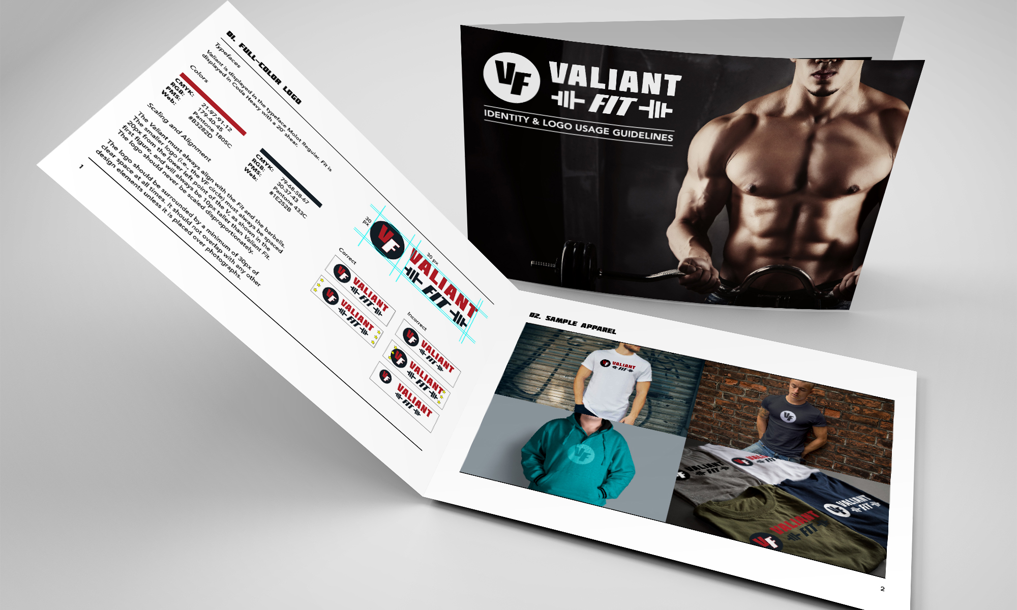
Design a logo for Valiant Fit, an online exercise equipment and apparel company.


Concept

The client asked for both a full-sized logo and a smaller logo that could still represent the company, such as the Nike checkmark; thus, it was important to keep a detachable element within the full-sized design. The final logo features an abstract representation of barbells, while the detachable element shows the company initials in the same font that is used in the full logo. I also created a style guide, which detailed (1) the logo specs, including typefaces, colors, and alignment; (2) the correct and incorrect ways to display the logo; and (3) possible uses for the logo (e.g., on stationery and apparel).

Two Hawks

/

Project

My popo (grandmother) asked me to help her publish and distribute her poetry. After the poems were typed, I had full charge of the project, which included (1) designing the book from the ground up and sending the design files to the printer; (2) picking up the finished books from the printer and mailing them; and (3) creating and emailing receipts.


Concept

Designing the book was tricky at first, because it didn’t have a title. While skimming the poems to see if there were any particular phrases I could use, I came across this one:

      Wild cries
             in the early morning mist
      Two hawks
             seeking each other.

A couple of her poems mentioned hawks, and a lot of them were about my grandfather and his relationship with Popo; thus, Two Hawks made sense. Once I had the title, I was able to plan and create the cover of the book. I also titled the chapters, using lines from other poems; created a table of contents; added footnotes to accommodate the extra notes that accompanied the poems; and wrote the copyright and acknowledgements pages. The final project was created in Adobe InDesign, and the cover illustration in Adobe Illustrator.

Miyazaki AFI Posters

/

Project

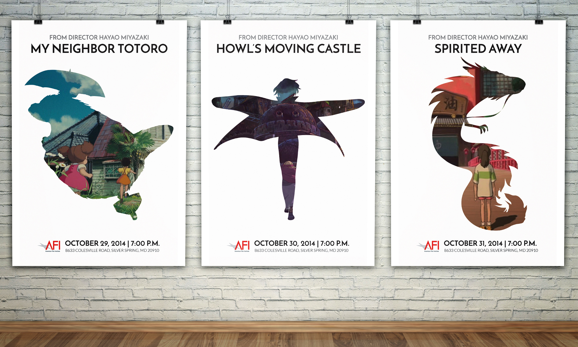
Design a series of three film posters for the AFI Director’s series at the AFI Silver Theatre and Cultural Center. They must be conceptually linked (e.g., director’s style, common themes, object carried through, etc), and should include film title, director’s name, location, and dates, as well as the AFI logo.


Concept

I chose Hayao Miyazaki, the director of My Neighbor Totoro, Howl’s Moving Castle, and Spirited Away. Though the details vary from movie to movie, all three share a common core:

  1. Protagonist moves to a new place (or, in the case of Spirited Away, is involuntarily transported to a new place).
  2. Protagonist meets a supernatural being who changes her life in some way.
  3. Supernatural being helps protagonist overcome the main conflict.

Thus, I needed a flexible design that (1) incorporated both the protagonist(s) and the supernatural being; (2) followed the general theme of moving and change; and (3) could be translated into three posters with minimal change from poster to poster. The final designs feature screenshots in which the protagonists are shown approaching their new homes for the first time, framed by the outline of the supernatural being.