I Made A Zoo

branding, print
/

I love what I do, but the problem is that I can’t share any of my work projects as-is because all of them are confidential. Thus I’ve developed a workaround: instead of putting up the actual projects, I take the templates from those projects and put together shortened versions using fake text and fake branding, as with the Bluth Company booklet. Other times I take those templates and go completely off the rails, as happened in this case. Whoops.

Backstory

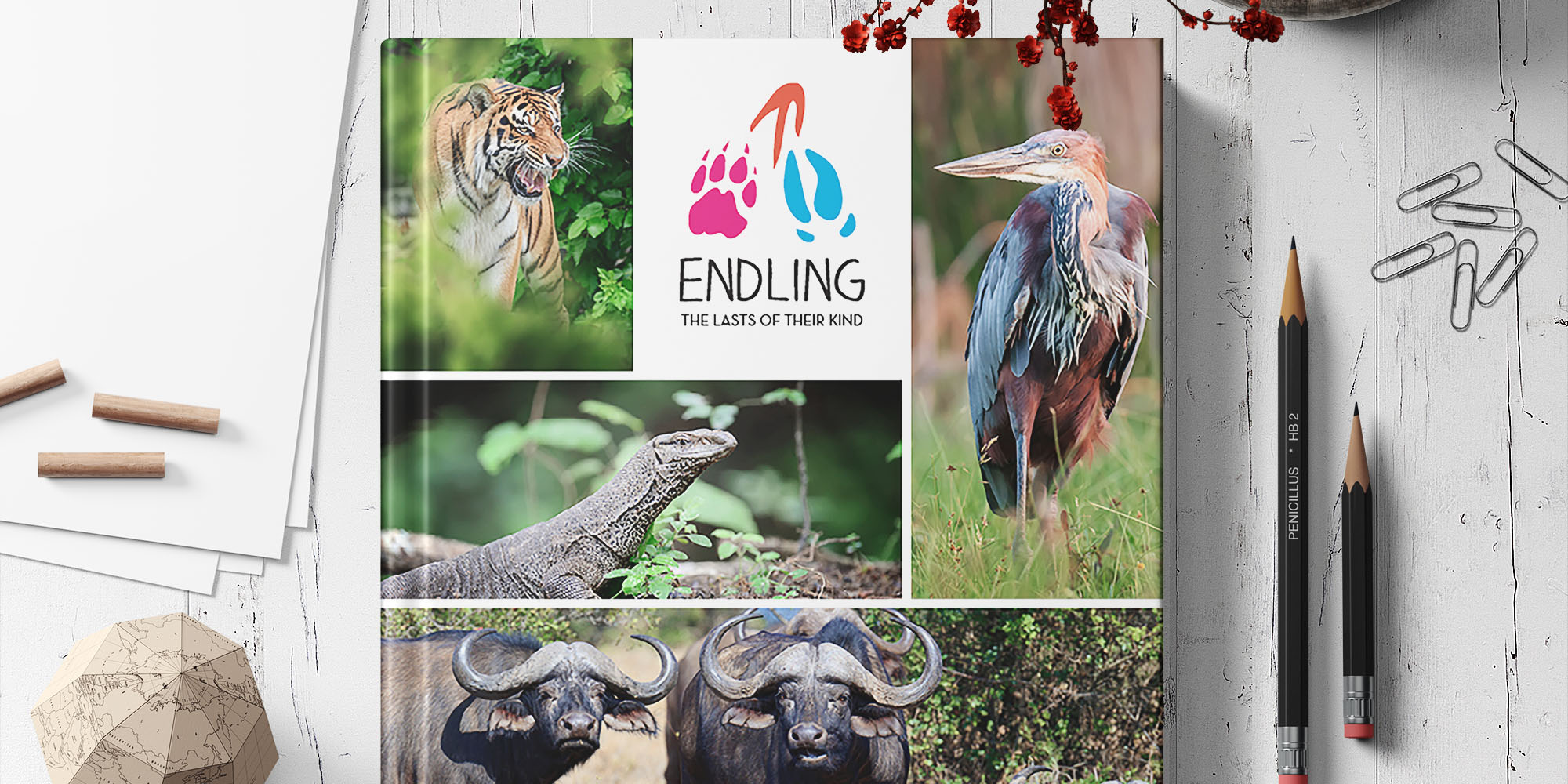
Last year I was the lead designer on a major proposal for a large zoo, which required a completely customized template. The process itself was a zoo, but I was pleased with how the proposal turned out, though I don’t know why I mention any of that because Endling ended up being quite different. In any case, I wanted to stick with the zoo theme, so I came up with Endling, a zoo whose occupants are all one creature away from extinction. (Others might call this “morbid” or “creepy.” I prefer “prescient.”)

Concept + Development

For me, development is usually informed by the color palette. Since I was pulling Endling out of thin air, I had to pick out the colors myself, which I did by playing around on Adobe Color until I had a combination I liked. I knew from the start that I wanted it to be bright and colorful, which helped.

Once I had the colors in hand, I started working on the logo. After going through a couple of typefaces, I picked the one that looked the most playful and started using it in my concepts. My first thought was to turn the G into an elephant’s head, but I didn’t really like how it turned out. Ultimately I went with the footprints, which are bright and colorful; can easily be translated into monochrome; have individual elements that can be used as accents to tie the brand together; and work well with the general theme of disappearing species.

Template

The next step was a general template for the guidebook. I wanted something light, playful, and photo-heavy. In the end, I combined elements from the zoo proposal with elements from another, more recent proposal in order to get the final Endling template.

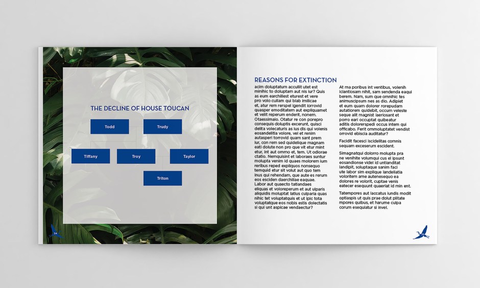
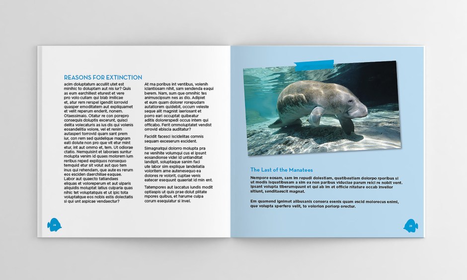
Getting the table of contents in place early was very useful. I decided ahead of time that the book would be divided into four sections – land animals, sea creatures, birds, and a conclusion section – and made a set of color-coded templates, using one color from the general palette for each section. I had originally planned to divide the book into sections by continent, but, well, I didn’t have enough animal photos for that.

Each section also has its own animal icons, which are used as a background for the page numbers. The fourth section is a general concluding section, and uses the pawprint from the Endling logo instead of an animal silhouette.

Breaking the Wheel

Of course, the project would be unspeakably dull if every page followed the template, so I always add at least a couple of unique spreads to break up the flow a bit and make the book pop. I hate that word, but unfortunately I actually do know what it means.

Final Thoughts

Sometimes I forget how nice it is just to design something for myself. This was a lot of fun, and I’m starting to feel like maybe the rest of my personal projects might happen sometime before the end of the current epoch.

The final project page can be found here. Click here to download the full booklet.

Redesigning Lorien

digital
/

I’ve been putting together a pdf portfolio over the past couple of days, which sounds charming on paper but in practice means what I’ve actually been doing is clawing through my design folders for presentable projects and crying over my vintage (i.e., 2011 – 2013) drawings. I haven’t had the courage yet to go back through the 2004 folder, but you never know when I might start feeling slightly reckless.

Anyway. During the course of my clawings and cryings I unearthed some oldies but goodies: Lorien wireframes! And then after I’d caterwauled a bit over the sheer volume of them I started thinking, No, this is good, I can put them on the blog because #PositiveThinking! (Note: I’m not including all of them because there’s like 10000000000 of them and only one of me and most of them are tiny iterations on a general theme and, really, who has the time to actually look at them all?)

Backstory

Okay, so for anybody who’s lost right now: from 2016 to 2017 I worked with a long-term freelance client, Lorien Health Services (LHS), a Maryland-based senior healthcare provider. About half of my work with them involved social media graphics and some print collateral; the other half was helping their social media director redesign their website, which when I first laid eyes on it was drab, depressing, and vaguely funereal. It was not the sort of website that would make me want to pack my bags and move in, because it looked like the end of the road. To be clear, LHS does provide hospice care, but they also offer a range of other services marketed to seniors and their families. (And to be very very clear, I did not use the word “funereal” in my first meeting with them. “Depressing,” on the other hand, was used, and was taken in stride.)

Preliminary Wireframes

I started with some simple mock-ups to showcase LHS’s requested palette and initial design ideas. In the beginning they were very clear about a few things:

  • Brightly colored hero images on every page.
  • A sidebar on every page for easier navigation.
  • Large enough text for potential residents to be able to comfortably use the site, but small enough for younger decision-makers (i.e., families of potential residents) to comfortably use as well.

And here we can see a visual representation of my thoughts hurtling through their neural pathways and the triumph of the human brain and my deep, deep love of storytelling and my profound connection with the human race and………yikes that’s a lot of guidelines. mmkay here’s a cleaned-up version:

A large part of incorporating LHS’s initial direction was finding stock images of seniors enjoying themselves, preferably outdoors, to steer LHS’s image away from the traditional Smiling-Nurse-With-Wheelchair-Patient photos. Luckily there was a vast body of brightly colored active senior photos online, which helped a lot with cleaning up the general look of the site. The first pass also included +/- buttons at the bottom of the sidebar, which allowed the viewer to increase or decrease the font size at need.

Back to the Crying Board

About halfway through the process, the LHS board changed their minds about the design they’d initially approved and decided that they wanted something more creative than other senior care providers. We screamed and tore out our hair, and then, when that didn’t work, we started looking at artsier websites. After some research, I proposed a gallery theme.

My initial idea was a bright mosaic with a sticky header (middle two boards), where every tile would be a photo representing a different LHS service. The tiles would flip on hover to reveal the service name and a brief description, and then a couple of buttons for more information; however, I also proposed two other versions with white bars separating the tiles. The version on the far left had captions rather than interactive tiles; the version on the far right had the white gutters but kept the interactive tiles.

Refining the Design

After LHS had approved the new direction, I incorporated their feedback into the final design, which ultimately was sent to a UX agency to be developed. (BAHAHAHAHA I’m making it sound like a clean and easy process. In real life there were like a hundred bamillion revisions between the mosaic mock-ups and the final design, and the UX people were developing what I designed every step of the way.)

Final Thoughts

I may complain a lot, but actually I’m glad I had the opportunity to work on a larger UI project: it made a nice change of pace from my print background, but I also got to learn more about accessibility and designing for an audience that may not necessarily be tech-savvy, and what is and isn’t possible when it comes time to develop.

The final project page can be found here.

Welcome to my Nerd Palace

illustration
/

Hi! You’ve reached akaKaro, a cranky little scrapblog staffed by an opinionated talking dictionary. Welcome to the madness.

Also my image upload kept coming up with freakin’ HTTP errors last night and I’m still traumatized from both WordPress AND Tumblr giving me grief but WP seems to have magically fixed itself so I’m seizing the chance to kick-start my blog while the going is good. This is what I meant by madness.

One of my chief difficulties in job interviews also happens to be most interviewers’ favorite question: “Can you describe your process to me?” I historically have not had a good answer for this because the honest answer is “What process?,” because my process is literally throwing things at a canvas and hoping they stick. Unfortunately that probably wouldn’t wash with most companies, with the result that my interviews generally sound like this:

“Oh, my process? Hahahahaha yeah I usually sketch things and then port them into Illustrator…” #lies

Cue miserable trailing off and hoping the interviewer is satisfied enough to ask me a question I can actually answer. My process has always been haphazard and tends to vary from project to project, but for some reason it didn’t occur to me until quite recently to start a process blog, with the goals of (1) observing my process and (2) putting together a better answer than the ones I’ve resorted to in the four years since I left graduate school.

With that in mind, here’s a progress shot of the new bio pic I’ve been working on for my About page:

I can actually describe my process for this one because I’ve been refining it since about 2003, when I first started coloring with Photoshop. Around 2007 I started drawing directly into the computer, and things kinda snowballed from there.

CliffsNotes

Underdrawing + Sketch

I start with a quick(ish) underdrawing to nail the pose down, then draw over it with a rough brush. I should note that I don’t excel at following my own underdrawings, and am insanely proud of how close this sketch is to the underdrawings.

Lineart

I don’t always do a full lineart, but this is going to be seen by gods know how many potential employers, so it needed to be an actual illustration rather than the random scraps I’ve been doing lately. In the lineart stage I go over the sketch with a hard brush, making corrections and/or additions as I go.

Flats

The flat color stage usually takes the longest and is my least favorite because I haven’t figured out an efficient way of coloring yet 🙁

Finishing Touches

After I get the flats down, I shade and add special effects. (First time painting sea creatures, can I hear a wahoo?)

Extra Credit

I used to browse through other people’s tumblrs/instagrams and cry over how much better their art was than mine, but that was a problem that corrected itself when I stopped keeping up with tumblr because #ProblemSolving! 😀