RITIS Redesign + App

/

Project

Come up with a possible redesign for the Regional Integrated Transportation Information System (RITIS) and adapt into a mobile app.


Redesign

As a side project I was asked to start designing a new layout for the CATT Lab’s main application, RITIS. The current design features a jam-packed navigation bar at the top of the page, so I moved most of the application options into a collapsible side bar, which gives the logo more space. I also consolidated the account settings and display options under a dropdown menu in the top righthand corner. The final screenshots were created in Adobe Illustrator.


Mobile App

RITIS currently has a mobile version, but it’s very outdated and requires the user to log in every time they open their mobile browser. As a commuter, I thought it might be handy to have an actual RITIS app to help me check traffic conditions without having to (1) log into RITIS or (2) continually resize the traffic map to fit on my phone screen. Using the existing mobile design as a baseline for which features could reasonably be included, I put together an app concept using the same color palette as the redesign, and later presented it to the Lab director as a possible future project.

The Science of Deduction

/

Project

I recently started a new project in which I develop my mobile UI skills by designing fake apps for fictional characters. For the project’s maiden voyage, I decided to design a mobile version of The Science of Deduction.


Concept

The Science of Deduction is a fictional website referenced in the BBC’s Sherlock, and—before the advent of John Watson’s blog—seems to be Sherlock’s primary method of attracting clients (until he enumerates 243 types of tobacco ash—but that’s another story). As such, the app needed to include Sherlock’s case files and the forum, through which he begrudgingly interacts with fans, potential clients, and the occasional nemesis. To maintain brand consistency, I used the color palette and background image from the existing design, and also used Helvetica throughout the app. The final screenshots were created in Adobe Illustrator; most of the text was taken from the original website, and was written by Joseph Lidster.

Two Hawks

/

Project

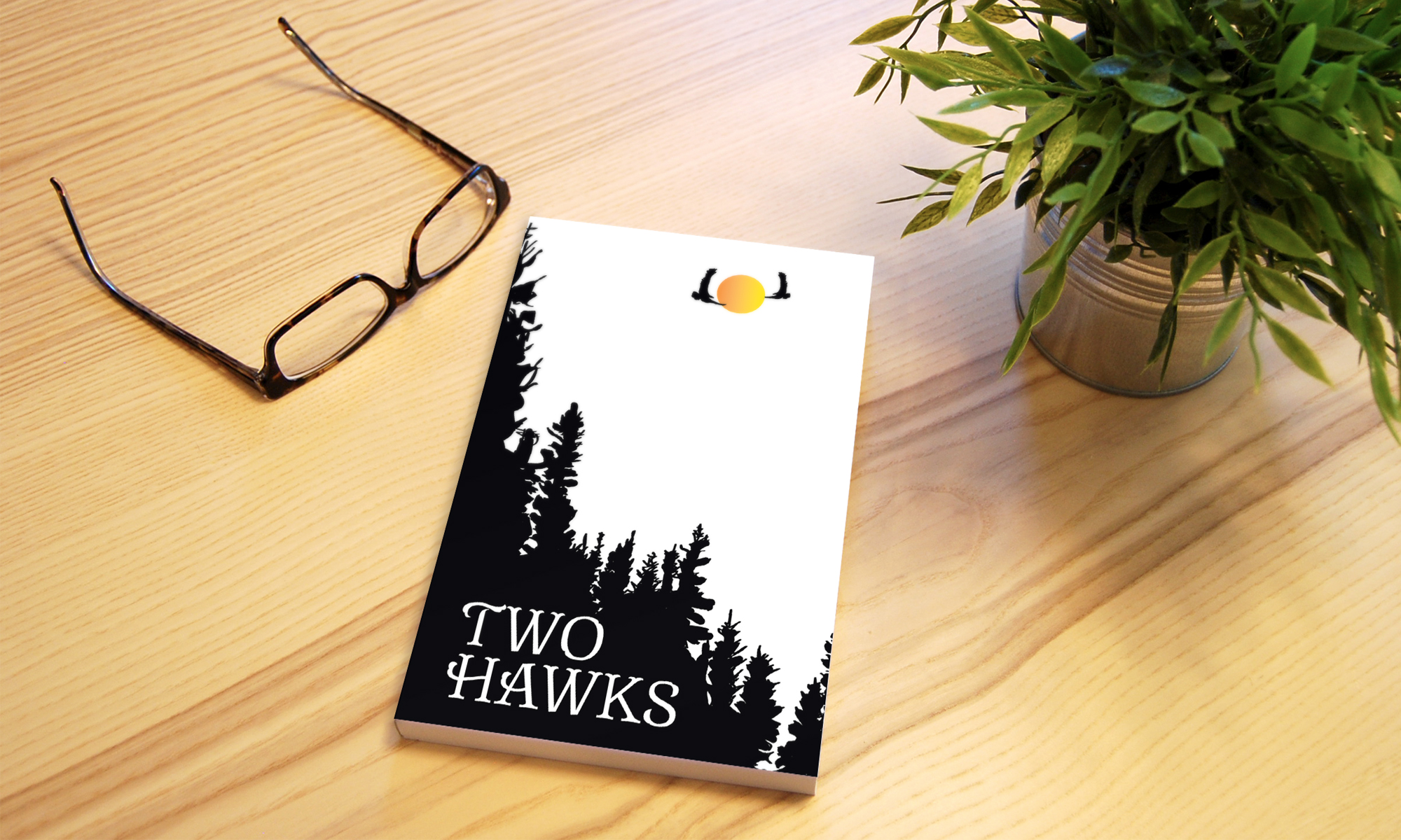
My popo (grandmother) asked me to help her publish and distribute her poetry. After the poems were typed, I had full charge of the project, which included (1) designing the book from the ground up and sending the design files to the printer; (2) picking up the finished books from the printer and mailing them; and (3) creating and emailing receipts.


Concept

Designing the book was tricky at first, because it didn’t have a title. While skimming the poems to see if there were any particular phrases I could use, I came across this one:

      Wild cries
             in the early morning mist
      Two hawks
             seeking each other.

A couple of her poems mentioned hawks, and a lot of them were about my grandfather and his relationship with Popo; thus, Two Hawks made sense. Once I had the title, I was able to plan and create the cover of the book. I also titled the chapters, using lines from other poems; created a table of contents; added footnotes to accommodate the extra notes that accompanied the poems; and wrote the copyright and acknowledgements pages. The final project was created in Adobe InDesign, and the cover illustration in Adobe Illustrator.

Trolémon Campaign

/

Project

Create a new product and campaign for Control Bear, using an identity that works with the company’s current brand.


Concept

Control Bear is a Japanese company built around the image of a bear removing its own head. The artist intended to encourage viewers to take control of their lives, and the bear has been incorporated into a number of products, including toys, keychains, and t-shirts.

Trolémon is a spin-off line of Control Bear keychains, which are dressed as the original 150 pokémon and are named accordingly (e.g., Trolichu, Trolbusaur, Trolizard). Each bear stands three inches tall and is attached to a carabiner, allowing customers to clip their bears to purses, backpacks, etc. As Trolémon is a subsidiary of Control Bear and is not a standalone product, it has only one webpage rather than a website; most of its navigation links to existing Control Bear pages, and its main purpose is to showcase the Trolémon line. Other deliverables included a Trolémon package design and digital ads, which mimic the classic pokédex seen in the Pokémon cartoon.

The final project was created in Adobe Illustrator, with illustrations also produced in Illustrator.