
Project
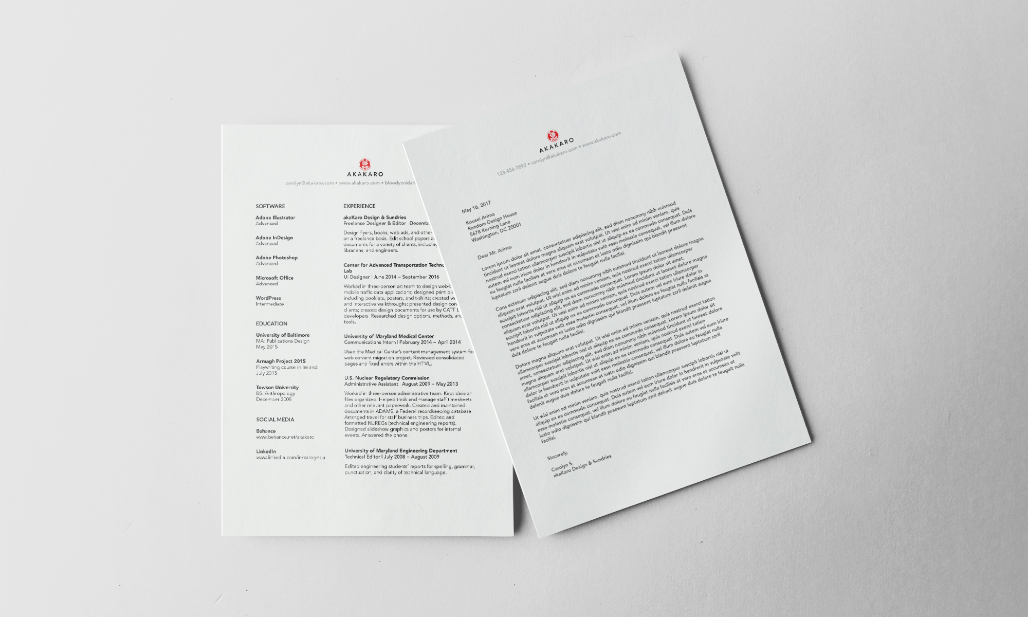
It’s been a long time coming, but it finally dawned on me that I now have a logo, business cards, AND a letterhead that need showing off! This is a historic day, because I’m actually happy with all of them (for now). My original portfolio was named Achikochi Design, but about a year ago I decided I wanted a URL that actually reflected my name, so I changed it to akaKaro, then slogged through a dreadful delightful rebranding campaign. Achikochi wasn’t even branded particularly well, but IT STILL TOOK SO MUCH TIME (though most of that was setting up the new website, resizing project photos, rewriting descriptions, etc, etc, etc). Never. Again.
Concept
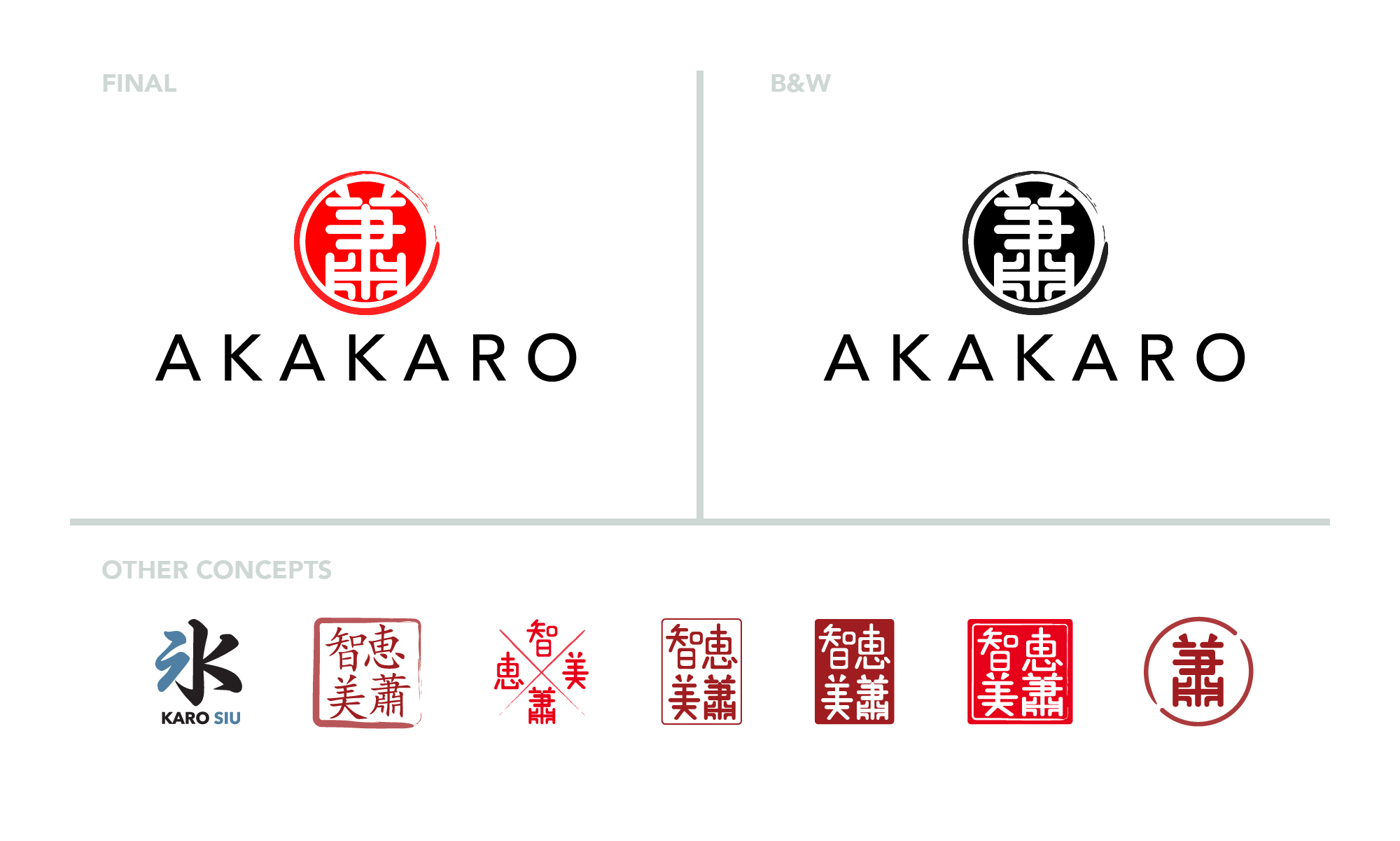
I went through several rounds with the logo: I still wanted it to look like a chop, but I also wanted it to use actual kanji, rather than the hiragana used in the Achikochi logo. The earliest version used the kanji for water, slightly modified to look more like my initials: I liked the idea of a water-themed logo, but later decided that I wanted to use my Chinese and/or Japanese names for a more personal feel. The next several iterations spelled out my entire name, but none of them really worked for me, and I eventually decided to cut it back to just my surname.
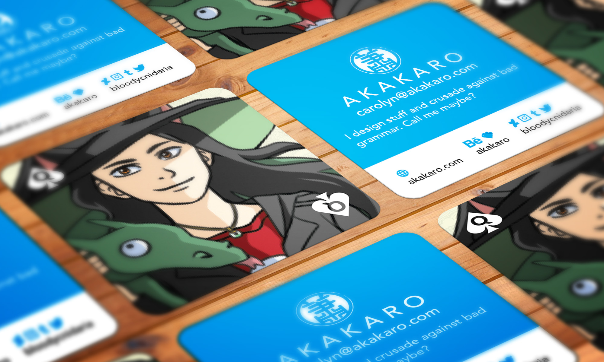
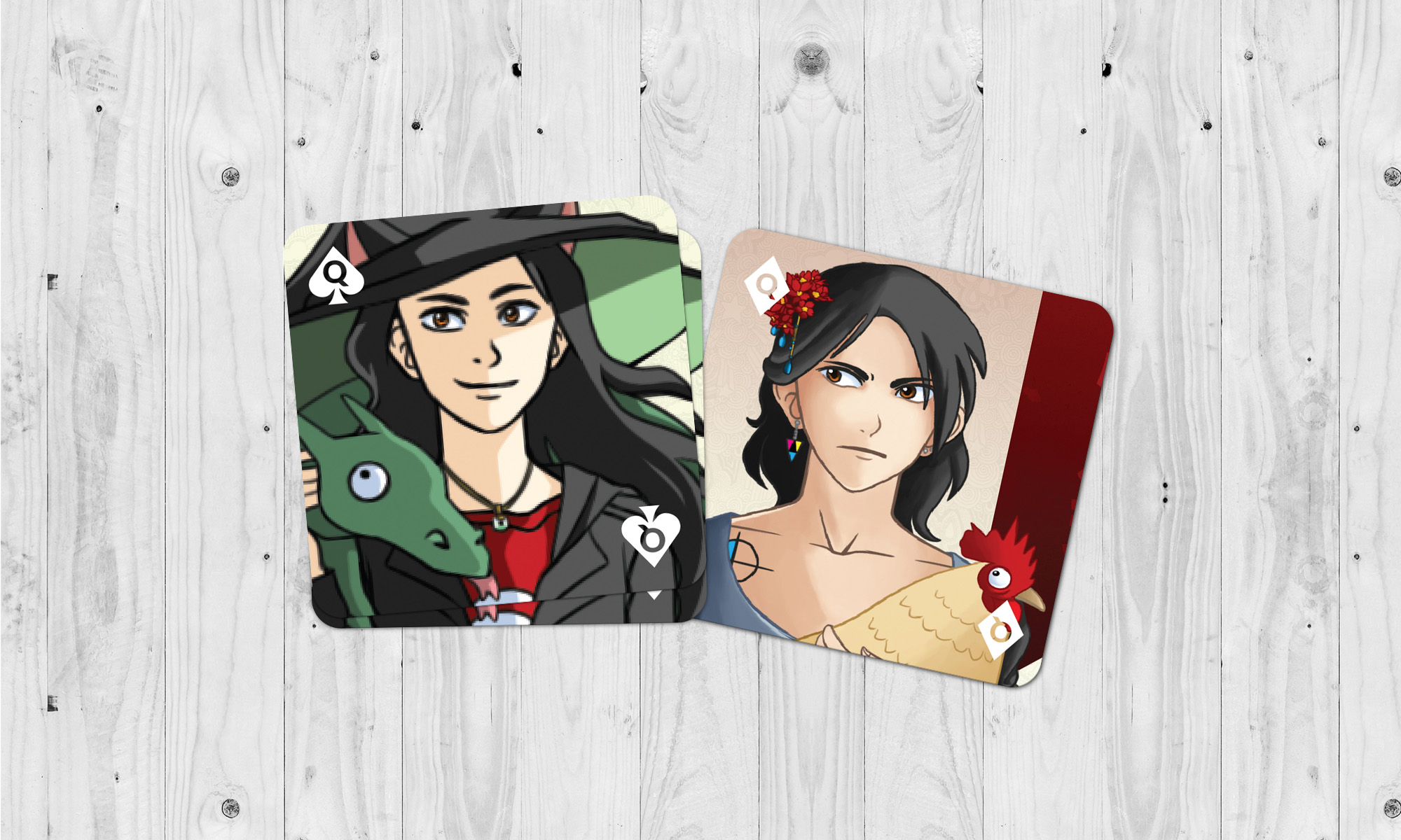
Meanwhile, my business cards also got a major update: they started out as MiniCards because I didn’t have much information on them, but while redesigning them I realized I’d need a lot more space to showcase both my new illustrations and my numerous social media accounts. The cards were designed around four self-portraits drawn within the past year, and were modeled after playing cards. This was mostly because, well, I like going up to people and telling them to pick a card, but it also works really well with the general theme of my life so far: I’ve worn a lot of hats since starting undergrad, and I like having business cards that more or less reflect my many-faced career.


