I’ve been putting together a pdf portfolio over the past couple of days, which sounds charming on paper but in practice means what I’ve actually been doing is clawing through my design folders for presentable projects and crying over my vintage (i.e., 2011 – 2013) drawings. I haven’t had the courage yet to go back through the 2004 folder, but you never know when I might start feeling slightly reckless.
Anyway. During the course of my clawings and cryings I unearthed some oldies but goodies: Lorien wireframes! And then after I’d caterwauled a bit over the sheer volume of them I started thinking, No, this is good, I can put them on the blog because #PositiveThinking! (Note: I’m not including all of them because there’s like 10000000000 of them and only one of me and most of them are tiny iterations on a general theme and, really, who has the time to actually look at them all?)
Backstory
Okay, so for anybody who’s lost right now: from 2016 to 2017 I worked with a long-term freelance client, Lorien Health Services (LHS), a Maryland-based senior healthcare provider. About half of my work with them involved social media graphics and some print collateral; the other half was helping their social media director redesign their website, which when I first laid eyes on it was drab, depressing, and vaguely funereal. It was not the sort of website that would make me want to pack my bags and move in, because it looked like the end of the road. To be clear, LHS does provide hospice care, but they also offer a range of other services marketed to seniors and their families. (And to be very very clear, I did not use the word “funereal” in my first meeting with them. “Depressing,” on the other hand, was used, and was taken in stride.)
Preliminary Wireframes
I started with some simple mock-ups to showcase LHS’s requested palette and initial design ideas. In the beginning they were very clear about a few things:
- Brightly colored hero images on every page.
- A sidebar on every page for easier navigation.
- Large enough text for potential residents to be able to comfortably use the site, but small enough for younger decision-makers (i.e., families of potential residents) to comfortably use as well.

And here we can see a visual representation of my thoughts hurtling through their neural pathways and the triumph of the human brain and my deep, deep love of storytelling and my profound connection with the human race and………yikes that’s a lot of guidelines. mmkay here’s a cleaned-up version:

A large part of incorporating LHS’s initial direction was finding stock images of seniors enjoying themselves, preferably outdoors, to steer LHS’s image away from the traditional Smiling-Nurse-With-Wheelchair-Patient photos. Luckily there was a vast body of brightly colored active senior photos online, which helped a lot with cleaning up the general look of the site. The first pass also included +/- buttons at the bottom of the sidebar, which allowed the viewer to increase or decrease the font size at need.
Back to the Crying Board
About halfway through the process, the LHS board changed their minds about the design they’d initially approved and decided that they wanted something more creative than other senior care providers. We screamed and tore out our hair, and then, when that didn’t work, we started looking at artsier websites. After some research, I proposed a gallery theme.

My initial idea was a bright mosaic with a sticky header (middle two boards), where every tile would be a photo representing a different LHS service. The tiles would flip on hover to reveal the service name and a brief description, and then a couple of buttons for more information; however, I also proposed two other versions with white bars separating the tiles. The version on the far left had captions rather than interactive tiles; the version on the far right had the white gutters but kept the interactive tiles.
Refining the Design
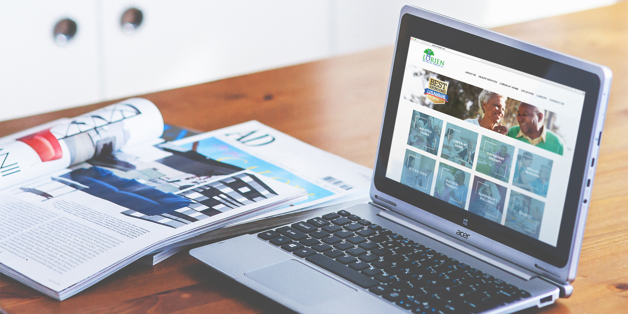
After LHS had approved the new direction, I incorporated their feedback into the final design, which ultimately was sent to a UX agency to be developed. (BAHAHAHAHA I’m making it sound like a clean and easy process. In real life there were like a hundred bamillion revisions between the mosaic mock-ups and the final design, and the UX people were developing what I designed every step of the way.)

Final Thoughts
I may complain a lot, but actually I’m glad I had the opportunity to work on a larger UI project: it made a nice change of pace from my print background, but I also got to learn more about accessibility and designing for an audience that may not necessarily be tech-savvy, and what is and isn’t possible when it comes time to develop.
The final project page can be found here.

